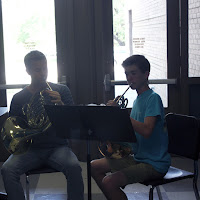
This picture uses the rule of balance and simplicity. The subject in this photo is the kid and his private instruction teacher. It is pretty clear what the subject in this photo is in this picture because the subject stands out. If the subject wasn't clear in this photo then i would have taken out the mergers surrounding the photo creating a border.

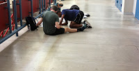
This picture uses the rule of thirds and lines. The subject in this photo is the kids in the left corner. It is really clear that the subject in this photo are the kids because the floor is really plain and simple. If the subject isn't clear then you would probably want a less complicated background.

i Like the pictures .
ReplyDeleteI really liked how you captured lines and balance in the 2 pictures in the top. The photos have a clear main subject, Good job!
ReplyDeleteI like how you used lines in your first photo to make the trophies stand out. I think that you could have a better focus on your pictures to make the subject stand out more.
ReplyDeleteI like how you have clear subjects in all of your pictures... Really nice job! However for the picture of the trophies, I think there is a different angle that would have been better to shoot from
ReplyDeleteSo this is a good effort. I think there were a few things you could have done better. First, make sure there are people in "academic" photos. The trophies are nice, but without a person, they have no meaning. The musicians would have been fine, but you took the photo with a window backlighting them and it just didn't work. In the third photo you needed to get closer and show them working. The foreground just has too much empty space to recover the image.
ReplyDelete