Monday, December 4, 2017
Friday, December 1, 2017
4 Websites
A. I saw a lot of pictures that look like they took a lot of time. These photos are really nice and show a really good perspective.
B. I learned that people in this world need to learn how to create these types of photos. Only a certain amount of people know these already which is why everybody need to learn them.
C. This website showed the different ways that you can take pictures, and tought me how to do some of these perspective photos.
A. I saw a 3d projector brought in a forest and light it up. The projector lit up the forest and it was giving it color.
B. All i can find is Friedrich Van Schoor and Tarek Mawad one of them is an animator and the other one is a photographer.
C. These two men wanted to find out if they could project images in the forest. These projections are mainly used on buildings but they wanted to see if it would work in the forest and it did.
D. I learned that using a 3d projector is a creative way of showing your love for art.
A. I saw a lot of spiral staircases that look really eye appealing. These staircases are created with Christian Richters huge camera with lens. He searches all over Europe for staircases that he can take pictures of.
B. I learned that you can make art out of anything and no matter what kind of condition it is in.
C. This site is related to photography because it shows one of the ways that people show their photos.
A . I saw a lot of really good portraits that showed emotion. These photos are shot by professional photographers, you can tell.
B. I learned that for a good self portrait/portrait you have to have good emotion.
C. This site is related to photography because portraits are a type of photography and is what we are learning right now.
Wednesday, November 29, 2017
My Favorite Cover
ESPN The Magazine, September 16, Floyd Mayweather in The Fight Issue
"Benjamin Lowy’s photograph of Floyd Mayweather wasn’t intended to be a cover; he took this shot for what we call a “technique shot.” Yet when we saw the defending champ demonstrating his famous shoulder roll, we knew it had to be the cover of our Fight Issue, one with profiles and separate covers of Mayweather and his opponent Canelo Alvarez. We decided to go with a bright white background—a rarity for The Magazine—to contrast the fighter’s dark skin, showing off the beads of sweat on his forehead and intense concentration in his eyes. We offer this cover as an athlete who is the embodiment of his craft in a rare moment when boxing rose to the top of the sports conversation."
What ESPN was trying to communicate with the readers by just looking at the cover was what Floyd Mayweather was famous for, his shoulder roll. You can see the champ dodging a punch and by the lighting you can tell that it is really serious. You can see that his sweat sticks out showing that he is working really hard to win. This picture is a really good environmental picture because of the way that Mayweathers body and facial expression are positioned. With he way that he isn't even looking at the camera or positioned for a picture really emphasizes the photo a lot.
Best Covers
1. Formal
2. Formal
3. Informal
4. Environmental
5. Environmental
6. Formal
7. Formal
8. Formal
9. Formal
10. Formal
11. Formal
12. Formal
13. Formal
14. Environmental
15. Formal
16.Environmental
17. Formal
2. Formal
3. Informal
4. Environmental
5. Environmental
6. Formal
7. Formal
8. Formal
9. Formal
10. Formal
11. Formal
12. Formal
13. Formal
14. Environmental
15. Formal
16.Environmental
17. Formal
Magazine cover # tips
1. Your magazine cover should be eye appealing when people look at it.
2. You don't want your magazine cover to be too complex, people can see what your product when they scan it.
3. You want to make the magazine cover worth the time and money
4. Make the audience curious about the product so that they can read more.
5. You want the magazine cover to be neat and organized.
Monday, November 27, 2017
Top 100 photos
1.
I chose the D-Day photo because it shows a lot of courage and mental prep to put your life on the line for your country.
2.
This photo was shot by a photographer who was under fire and could barely take any photos. He sot this photo of Huston Riley as it took Riley 30 minutes just to reach the shore. While he was trying to reach shore he was also getting shot by the nazis.
3.
i learned that a lot of American soldiers died trying to invade the beaches of Normandy.
4.
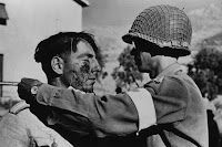
5. NAME: Robert Capa
BORN-DEATH: October 22,1913; May 25,1954
BORN: Endre Friedmann, Spain
SCHOOL: Didn't attend
1. i chose the Hindenburg Disaster because it was a tragic event that happened in the 1930's.
2. While Sam Shere was waiting for his Zeppelin to arrive it caught fire and killed 36 civilians along with it. The media saw the whole thing and when it caught flame people went into complete utter shock.
3. i learned that nobody was expecting it and when it did they were in shock.
4.
5. NAME: Sam Shere
BORN-DEATH:
I chose the D-Day photo because it shows a lot of courage and mental prep to put your life on the line for your country.
2.
This photo was shot by a photographer who was under fire and could barely take any photos. He sot this photo of Huston Riley as it took Riley 30 minutes just to reach the shore. While he was trying to reach shore he was also getting shot by the nazis.
3.
i learned that a lot of American soldiers died trying to invade the beaches of Normandy.
4.

5. NAME: Robert Capa
BORN-DEATH: October 22,1913; May 25,1954
BORN: Endre Friedmann, Spain
SCHOOL: Didn't attend
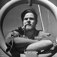
1. i chose the Hindenburg Disaster because it was a tragic event that happened in the 1930's.
2. While Sam Shere was waiting for his Zeppelin to arrive it caught fire and killed 36 civilians along with it. The media saw the whole thing and when it caught flame people went into complete utter shock.
3. i learned that nobody was expecting it and when it did they were in shock.
4.
5. NAME: Sam Shere
BORN-DEATH:

Wednesday, November 15, 2017
FASHION
1. The people made the models face brighter/lighter and also put makeup on her face
2. The people photoshopping the model made her skinnier and they also made her taller.
3. The other group of people made a pizza turn into a pizza
4. No because a lot more people prefer originality and people rarely prefer photoshop
5. When you use photoshop this much and make this many changes.
6. Slight changes are okay, but when you start changing someones body shape thats when it goes too far.
7. Photojournalism is natural and no manipulation, while fashion is the exact opposite.
8. The less photography you use the closer it becomes to reality
9. You are showing us to never judge a book by its cover
10. Because guys have a different mind set and they wont care
Monday, November 13, 2017
portraits from articles
2.A self-portrait can reveal a lot about you, by including props and even other people that are meaningful in your life.
3.Practice with people you know so that you are comfortable; people can sense when you aren't.
ENVIRONMENTAL PORTRAITS
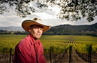
I chose these photos because you can see what these people do and where they do it. You don't need a whole lot of background information to know what these people do.
SELF PORTRAITS
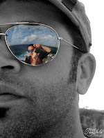
I chose these photos because these people used a creative way to express themselves. They used a reflection.
CASUAL PORTRAIT
I chose these photos because you can tell a lot just by their expression. These people both have different expressions which gives the picture life.
Monday, October 30, 2017
American Soldier
A. The most powerful picture in this article is the picture where he says his goodbyes to his family. It's the most powerful because it's the start of his journey in the army.
B. They tell a story by going in chronological order and shows how he becomes a developed soldier
C. The captions help because they go into detail and tell background information that we can't tell from just the photo.
D. Ian started out as a rookie and throughout his military experience he learned more even when it got tough. He eventually quit and shortly after he got married.
E. In the pictures where Fisher is the main subject the caption is usually in present tense.
F. The captions are usually about 4-5 sentences. The second sentence usually consists of background information we can't tell from just the photo. The first sentence usually consists who, what, where, when, and how. The third sentence usually consists of a quote from somebody mentioned. Most of the captions do have quotes. Only some of the captions have 4 sentences.
G. If there are good pictures then it could be really easy to tell a story with just pictures and captions.
H. Pictures and captions can only tell so much, therefore you could write a story for extra detail.
Friday, October 27, 2017
Wednesday, October 25, 2017
Funny Captions
Last night granny finally let me put the NFL symbol on the head. She shouldn't have chosen the Atlanta Falcons over my New England Patriots!
This is what happened yesterday when grandpa heard that my sister,Megan, was going to cook for Thanksgiving. He should have put his name in the hat, but he didn't.
Throwback to when grandpa waited too long to blow out his candles on his 87th birthday! We should have known that he wasn't going to say anything; he's a quiet guy.
Aperture, ISO, and Shutter Speed
F2.8 PHOTO
APERTURE
1. The eyes should be because they dilate.
2. The smaller the aperture the darker it gets and the higher the aperture the lighter it gets.
3. Aperture impacts the depth of field by showing the focus of the picture.

F 16 or higher
SHUTTER SPEED
HIGH SHUTTER SPEED
SLOW SHUTTER SPEED
1.
APERTURE
1. The eyes should be because they dilate.
2. The smaller the aperture the darker it gets and the higher the aperture the lighter it gets.
3. Aperture impacts the depth of field by showing the focus of the picture.

F 16 or higher
SHUTTER SPEED
HIGH SHUTTER SPEED
SLOW SHUTTER SPEED
1.
Monday, October 23, 2017
Abandoned Theme Parks
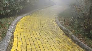
1. I would take my camera to the Wizard of Oz Theme park. I would take here because it's (in my opinion) the scariest park, and has the most color
 2.
2.
3. a) Inside a haunted mansion
b) abandoned cities
c) woods at NIGHT
d) a circus
e) Hospitals
4.
5. I think that it would be interesting to document and take photos in an abandoned hospital because of all the history behind them. If you could find old newspapers or posters it would be pretty exciting. Not only would an abandoned hospital be exciting but it would also be really creepy and a spin chilling experience.
6. we would need some sleeping bags, a tripod, and a ton of working cameras. If you take photos you have to have the same experience because it brings life and spookyness to the photo.
 2.
2.3. a) Inside a haunted mansion
b) abandoned cities
c) woods at NIGHT
d) a circus
e) Hospitals
4.
5. I think that it would be interesting to document and take photos in an abandoned hospital because of all the history behind them. If you could find old newspapers or posters it would be pretty exciting. Not only would an abandoned hospital be exciting but it would also be really creepy and a spin chilling experience.
6. we would need some sleeping bags, a tripod, and a ton of working cameras. If you take photos you have to have the same experience because it brings life and spookyness to the photo.
African Pictures
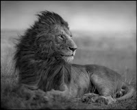
1. I saw some really detailed pictures of animals in Africa, and he used really good techniques. In the part of the reading where he said that he had to wait 18 days, that shows some dedicating. He said that he waited that long to just get 4 pictures of the lion. He had to wait for the lion to wake up and eventually he got the photo that he wanted. This photographer is really dedicated and loves to take detailed pictures of the animals in the African safari.
 2
2
3. I picked this picture because it shows that the lion is the king of all animals. I can tell this just by looking at this picture, and of how confident it looks. I also like this picture because it shows that it's a windy day and it fits the lion perfectly.
4. This picture uses the rule of balance. It shows perfect balance because the picture isn't lopsided,and the weather fits this lion perfectly. Everything is perfectly balanced and the lion is the main subject.
5. Nick Brandt wants to use a different lens because telephoto lens are too easy to use because you can just zoom in to your picture. He wants to get up close to the animal because it creates personality to the photo and is in general just a better photo.
6. Nick Brandt loves taking these photos because he said that he wants to be different and in being different he wants to create photos that have personality of animals.
7. He hopes that the poachers that hunt down these animals will just stop, and leave these animals alone. Obviously it isn't going to stop completly but he wants it to dil down a little.
8. "There is something profoundly iconic, mythological even, about the animals of East and southern Africa."
 2
23. I picked this picture because it shows that the lion is the king of all animals. I can tell this just by looking at this picture, and of how confident it looks. I also like this picture because it shows that it's a windy day and it fits the lion perfectly.
4. This picture uses the rule of balance. It shows perfect balance because the picture isn't lopsided,and the weather fits this lion perfectly. Everything is perfectly balanced and the lion is the main subject.
5. Nick Brandt wants to use a different lens because telephoto lens are too easy to use because you can just zoom in to your picture. He wants to get up close to the animal because it creates personality to the photo and is in general just a better photo.
6. Nick Brandt loves taking these photos because he said that he wants to be different and in being different he wants to create photos that have personality of animals.
7. He hopes that the poachers that hunt down these animals will just stop, and leave these animals alone. Obviously it isn't going to stop completly but he wants it to dil down a little.
8. "There is something profoundly iconic, mythological even, about the animals of East and southern Africa."
Wednesday, October 18, 2017
Angelos photos reflection
1. In the beginning i thought it was just a happy couple and felt good for them. But as i made my way down i suddenly noticed what was going on....she had cancer. Then i started to feel sorry for then man.
2. I think that its a good way of putting things when your in a tight situation like he is.
3. I could shoot photos like this because these kind of photos are very interesting to look at and are a good example of other peoples pain and could make somebody feel sympathy for you.
4. I would tell him that i feel sympathy for him and that he takes good and emotional photos.
Friday, October 13, 2017
Great B&W photographers 3
1. What first caught my eye while looking at this photographers photos was the setting. His photos take place during war.
2. A) In the first picture i could see all the chaos and explosions of war. All the violence that is going on is so surreal. I can smell gunpowder and bloodshed as the war continues. The smell is almost unbearable as nobody even notices it. I hear the groans of men as they get hit or wounded. The explosions are nearly deafning and deadly. I taste the blood of my fallen colleagues. Their bodies lie dead right next to me. I feel the stirring wheel turn according to my movements. The touch is so soft and nice.
B) In the second picture i could see the explosions and my gun aiming down sights to opposite site of my teammates. The enemy is getting smaller as i run to take cover. I smell burning bark from the fires created. The smell is overtaking ALL my senses. I hear the ringing in my hears, and captain screaming but i don't know what he is saying. The steady gunfire is the only thing that is important. I taste dirt as it falls on my face. The blood is overwhelming, too overwhelming that i have no choice but to breathe it in. I feel my hands while everything is numb. My guns smooth and silk edges are the only thing keeping me alive.
3. I would like to create a poster just for this photographer, because i like his ideas with the war setting.
Mural Project Preview
1. a) One idea we could take some pictures of the school environment.
b) We could take some photos of the campus and kids around it
c) Maybe some after school programs, sports, electives,etc.
2. You will need to think about aperture, shutter speed, and the ISO.
3. I would suggest to put these on a social media site like instagram or something else. You could also think about putting these on another blogging site where a lot of people put their work.
Wednesday, September 27, 2017
Photo Manipulation and Ethics
A. Product validity has become big issue when photographers photoshop photos. Photo manipulation is mainly used to increase sales. When people use photoshop they "wreak havoc" on hardworking journalists.
B. They give all of their photographers specific guidelines that they have to follow.
C. I think that you could use very little manipulation if your going to use it.
D. I think that this is the worst picture manipulated because the photographer made such a big change. The photographer also changed the position and altered with it too much.
E. In my opinion this photo is least unethical. I think this because it shows the least amount of change and is still the same picture. For example, the picture above has a lot of things changed. On the other hand, the one down here has only the color changed.
Monday, September 25, 2017
Academic Shoot reflection and critique
1. Some challenges i encountered when i went out to shoot was the amount of space i had. I feel like if an academic event was going on i could have got some really good shots.
2. I wanted to get some horizontal photos because i wanted to mix it up but unfortunately i couldn't get any.
3. I would have went into more classes and got some good horizontal photos. Also i wanted to use at least 3 rules in one photo.
4. I would keep the multiple rules in each picture the same.
5. I think the rule of lines would be the easiest to accomplish.
6. I think the avoiding mergers would be pretty difficult especially if you in a small compact space like in a classroom or small hallway.
7. I'm still a little confused on the rule of balance. I could just reread the slides on balance if i want to 100% understand it.
http://ellasphotojblog.blogspot.com/2017/09/photoshop-3-5-images.html
Friday, September 22, 2017
Academic photoshopped photos
This picture uses uses the rule of lines because of the lines in the background. The subjects in this picture in this picture are the trophies. It is clear what the subjects are in this photo because of the shininess in the trophies. If the subjects in this photo weren't clear then i would have taken this photo in a less complicated/distracting background.
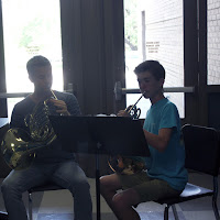
This picture uses the rule of balance and simplicity. The subject in this photo is the kid and his private instruction teacher. It is pretty clear what the subject in this photo is in this picture because the subject stands out. If the subject wasn't clear in this photo then i would have taken out the mergers surrounding the photo creating a border.
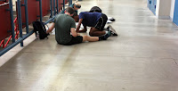
This picture uses the rule of thirds and lines. The subject in this photo is the kids in the left corner. It is really clear that the subject in this photo are the kids because the floor is really plain and simple. If the subject isn't clear then you would probably want a less complicated background.

This picture uses the rule of balance and simplicity. The subject in this photo is the kid and his private instruction teacher. It is pretty clear what the subject in this photo is in this picture because the subject stands out. If the subject wasn't clear in this photo then i would have taken out the mergers surrounding the photo creating a border.

This picture uses the rule of thirds and lines. The subject in this photo is the kids in the left corner. It is really clear that the subject in this photo are the kids because the floor is really plain and simple. If the subject isn't clear then you would probably want a less complicated background.
Wednesday, September 13, 2017
Great B&W photographers 2
W. Eugene Smiths full name is William Eugene Smith and he was born on December 30, 1918 in Wichita, Kansas. He was an American photojournalists, and he was most common for his WWII brutal photos. He also served as a nurse in WWII. He went to high school in Wichita, Kansas then he eventually moved to New York and worked at Newsweek. He eventually got fired because he refused to use a medium format camera. Smith and other photojournalists were on the front lines when we fought japan.
2012 Academic Community Service questions
I chose the photo where the student is in the library reading a book.
1. I chose this photo because it has good simplicity, and excellent framing with the book shelves around the photo.
2. Some of the rules of photography in this photo that a i can see are simplicity, framing, rule of thirds, and lines.
1. I could go to the library for some photos like the ones i saw today.
2. I would like to go to the library for some cool photographs.
3. In order to take some good photos like the ones i saw today i would have to learn more about the camera.
Monday, September 11, 2017
Filling the Frame
This frame is filled with all of the mechanical/vents. We can easily see the subject and what the photographer was trying to capture in this photo.
Action and Emotion
I chose this photo because it shows a lot of emotion because of her facial expressions. Also the action that she is doing with her hands. it looks like these students are in some kind of theatre arts class.
Subscribe to:
Comments (Atom)


